

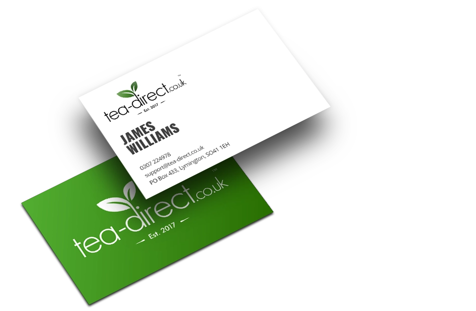
Tea Direct is a UK-based tea retailer focused on delivering high-quality loose leaf and speciality teas directly to customers. The brand needed a fresh, modern identity that reflected purity, sustainability, and a direct connection from leaf to cup—without feeling overly traditional or old-fashioned.
The brief was to create a versatile logo and visual system that could work seamlessly across packaging, digital platforms, and printed materials, while establishing a strong, recognisable presence in a competitive market.
The Challenge
The tea market is saturated with heritage-heavy brands and overly decorative packaging. Tea Direct needed to stand out with a clean, contemporary look that still communicated natural quality, trust, and craftsmanship.
Key challenges included:
- Creating a logo that felt modern but timeless
- Ensuring strong legibility across small and large formats
- Designing packaging visuals that felt premium yet approachable
- Maintaining consistency across physical and digital touchpoints
The Solution
The identity was built around simplicity, balance, and nature-led cues.
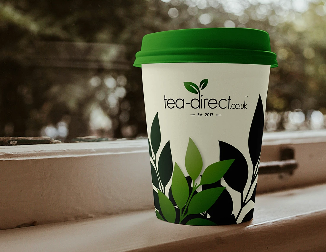
A custom wordmark was designed with clean typography, paired with a subtle leaf motif to instantly signal freshness and natural origin. The leaf icon integrates organically with the logotype, reinforcing the brand name while adding character and memorability.
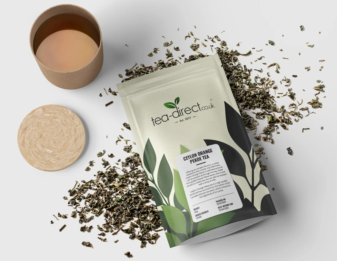
A restrained green colour palette was chosen to evoke growth, calm, and sustainability, while allowing the logo to work confidently on both light and dark backgrounds. Supporting graphic elements inspired by tea leaves were introduced to add depth and movement across packaging without overwhelming the design.
The system was carefully tested across:
- Tea packaging
- Branded takeaway cups
- Business stationery
- Digital and promotional assets

Want to discuss your next project? Get in contact and we’ll put the kettle on!
